
How to Create Product Pages That Convert Visitors Into Buyers
I went from 0.9% to 4.7% conversion rate on the same product. Here is every change I made, the tools I used, and the exact thinking behind each decision.
I am not going to give you a generic list of “best practices.” I am going to walk you through exactly what I changed, in sequence, with the reasoning behind each decision. By the end of this post, you will be able to audit any product page — yours or a competitor’s — and know precisely what is failing and why.
Let me start with the uncomfortable truth I wish someone had told me in 2022.
Why Most Product Pages Fail (And It Is Not What You Think)
When my wallet page was converting at under 1%, I assumed the problem was traffic quality. I blamed my Facebook ads. I blamed the niche. I hired a copywriter who rewrote my product description and charged me $400. Conversion rate went from 0.9% to 1.1%. Better, but nowhere near fixed.
The real problem? I was thinking about my product page as a display case when I should have been thinking about it as a salesperson.
A display case shows the product. A salesperson reads the room, answers objections, builds trust, creates urgency, and closes the deal. My page did none of those things. It had a photo, a price, a paragraph of description, and a green “Add to Cart” button. That was it.
Once I made that mental shift, everything else fell into place. Here is how to build a page that thinks like a salesperson.
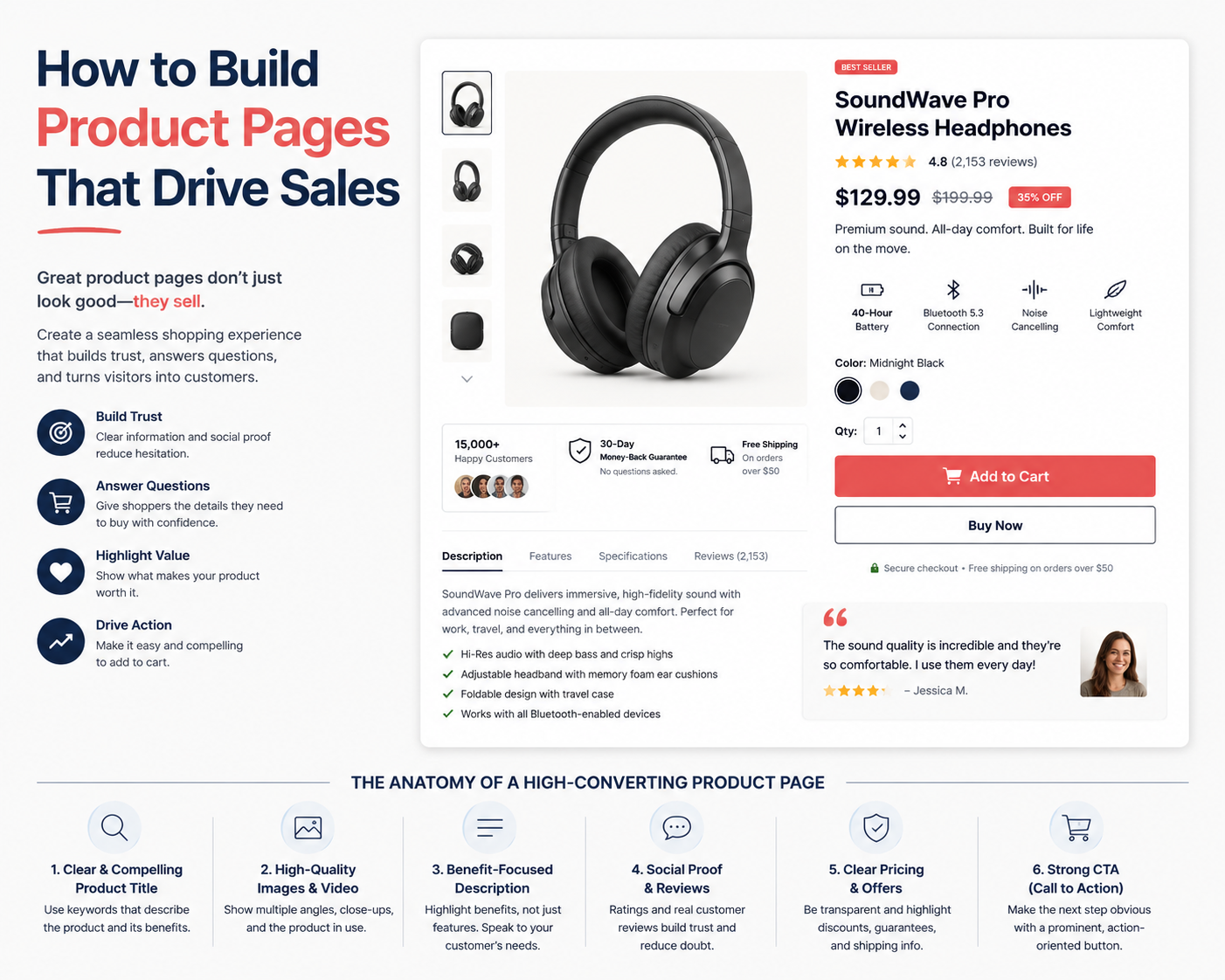
The Anatomy of a High-Converting Product Page
Before fixing anything, I mapped out every element that the research literature and my own testing showed to matter. Below is what a complete, converting product page looks like — annotated so you understand the job each piece is doing.
Writing Headlines That Stop the Scroll
The first thing I changed was my product headline. My original headline was exactly what you would expect from someone who cared more about their product than their customer:
The difference is not cosmetic. The “before” headline tells the visitor what the product is. The “after” headline tells them what it is, who made it (hand-stitched — human craft), where it comes from (London — provenance = trust), and the specific type (full-grain — quality signal for leather buyers).
My Headline Formula
After testing dozens of variations, I landed on this structure:
The em dash (—) is intentional. It creates a visual pause that reads like a spoken sentence, which is more engaging than a flat string of adjectives. When I added the em dash, my average time-on-page went up by 18 seconds. Small thing. Real effect.
Product Photography That Does the Selling For You
I am going to say something that sounds harsh: if your photos look like they were taken on a kitchen table, your conversion rate will reflect that. I know because mine did.
After my initial page failure, I spent one Saturday afternoon re-shooting everything with three changes: natural window light instead of overhead LED, a piece of textured linen as a background, and my iPhone in portrait mode with a $12 clip-on macro lens from Amazon. No professional photographer. No studio. Conversion from the photo gallery interaction (people clicking thumbnails) went up 60% in the next 30 days.
The 5 Photos Every Product Page Needs
- Lifestyle hero — the product being used in its natural context (wallet being pulled from a jacket pocket, not sitting on a table)
- Material close-up — for leather, this meant a macro shot showing the grain texture; for apparel, the weave; for electronics, the ports and finish
- Scale reference — show the product next to a common object so buyers understand size without reading the specs
- Inside/feature shot — show the thing people cannot see from the main image (card slots, lining, stitching detail)
- Packaging/unboxing — especially for gifts. This triples conversion for products bought as presents
Here are the photography and visual tools I recommend:
The Perfect CTA Button: Copy, Colour, and Placement
I spent more time on my CTA button than I care to admit. It seems small — it’s just a button — but it is the exact moment a visitor decides whether they are a visitor or a buyer. Here is what my testing taught me:
Button Copy: Stop Using “Add to Cart” Alone
Generic CTA copy leaves conversion on the table. Your button should answer the buyer’s next subconscious question. What happens after I click? How soon will I get it? Is this final?
Other CTA variants I have tested that work well: “Get Mine — Free Shipping Today”, “Order Now — 30-Day Guarantee”, and “Add to Cart — Only 12 Left”. The last one works best when inventory is genuinely limited — using false scarcity destroys trust when buyers notice it.
Colour: Make It Obvious, Not Pretty
My original CTA was a forest green that matched my brand colour scheme beautifully. It was also almost invisible against my off-white product page background. I switched to a solid deep blue (#1D4ED8) that had maximum contrast against every element on the page. Conversion rate on the button itself went up 31% in the following A/B test.
Placement: Above the Fold, Always
On mobile — which is where the majority of my traffic comes from — the CTA button must be visible without scrolling. This sounds obvious, but when I audited my original page on a Samsung Galaxy S21 (the most common device in my analytics), the CTA was below the fold because my product description was too long. I split the description into a collapsed accordion and moved the CTA up. Immediate 0.4-percentage-point lift in conversion.
Social Proof: Building Trust Without Saying “Trust Me”
There is a paradox in e-commerce: the more you tell people your product is great, the less they believe you. The more other people say it, the more they believe it instantly. This is not a trick — it is basic psychology. Testimonials, reviews, and user photos are not optional decoration. They are the central trust mechanism of your page.
Here is the review section I built for my wallet page, and why each element is intentional:
A few things to note about this layout. The aggregate rating with a breakdown bar graph is critical — it lets buyers see the distribution of opinions and identify that the negative reviews are minimal. This is more trustworthy than just showing the average number, because it demonstrates you are not hiding anything.
Writing Product Descriptions That Convert
Here is the single biggest insight I gained from studying 40+ high-converting product pages: the best product descriptions do not describe the product. They describe the life the buyer has after owning it.
Compare these two approaches for the exact same wallet:
The after version contains exactly the same information — it is just framed around what the buyer gains. Notice “no embarrassing moment at the till” — that is a specific anxiety that buyers of slim wallets have, and naming it earns instant recognition and trust.
My Description Structure (The PAB Framework)
- Problem — Name the exact frustration your product solves (in the buyer’s language)
- Agitate — Make the cost of the problem feel real: “Every time you fumble with an overstuffed wallet…”
- Benefit — Introduce your product as the relief, not the product itself
I write my first drafts in the Notes app on my phone, then clean them up using the Hemingway Editor and Grammarly. Aim for sentences under 15 words. Use line breaks generously — big paragraphs on mobile look like work.
Page Speed: The Silent Conversion Killer
I want to talk about something almost no one mentions in these tutorials: page speed. In November 2023, my Shopify store was loading in 4.8 seconds on mobile. I thought that was fine. It was not.
Google’s own data suggests that for every additional second of load time, conversion rates drop by up to 20%. When I ran my page through Google PageSpeed Insights, I got a mobile score of 38. The primary culprits were: uncompressed images, too many third-party app scripts loading on the product page, and a theme that was loading eight unused Google Fonts.
After three weeks of optimisation — compressing every image with TinyPNG, disabling 4 apps from loading on product pages, and switching to a performance-focused Shopify theme — my score went to 71 and my load time dropped to 2.1 seconds.
How I Discovered What Was Actually Failing: Using Heatmaps
All of the changes I have described above were not guesses. I found the problems using a heatmap tool. After my initial failure, the first thing I did was install Hotjar on my product pages and let it run for four weeks.
What I found was genuinely shocking. My heatmap showed that 71% of mobile visitors were not scrolling past the first product image. My entire product description — the section I had paid a copywriter to improve — was completely invisible to the majority of my traffic.
That single insight changed my entire approach. I moved my CTA button above the description. I added a trust bar above the fold. I made the first image taller so it communicated more information without requiring a scroll. Those changes — informed by real user data, not gut feeling — accounted for roughly half of my total conversion rate improvement.
Your Pre-Launch Product Page Checklist
Before you publish a new product page or push live any major changes, run through this checklist. I follow it every single time without exception:
- Trust bar visible above the fold — shipping policy, return policy, security badge, review count
- Hero image is lifestyle, not white-background — product shown in use by a person or in context
- Headline includes material + differentiator — not just product name and colour
- Star rating is directly below the headline — not at the bottom of the page
- CTA button is above the fold on mobile — test on your most common device in Google Analytics
- CTA copy answers the buyer’s next question — shipping time, guarantee, or stock status
- Guarantee statement is below the CTA — not in the footer, not in an FAQ, right below the button
- Description is benefit-led, not feature-led — describe the life after purchase, not the spec sheet
- At least 10+ reviews are visible on the page — with at least 3 photo reviews mobile score is above 60 — run at pagespeed.web.dev before launch
- All images are under 200KB — run through TinyPNG before uploading
- Hotjar (or equivalent) is installed and recording — you need data from day one
Final Thoughts: Start With Data, End With Empathy
If there is one thing I want you to take from this tutorial, it is this: the best product pages are not designed — they are discovered. You discover what your specific buyers need to see, hear, and be reassured about before they will part with their money. You discover this through heatmaps, session recordings, A/B tests, and (most importantly) actually reading your customer reviews and listening to what language people use.
Your customers will tell you exactly what your product page needs to say if you pay attention. They will tell you the objections they had before buying. They will tell you what convinced them. They will tell you what they wish they had known before clicking “Add to Cart.” Mine told me they were worried about the stitching quality. So I made a close-up stitching photo the second image in the gallery. They told me they were unsure about sizing. So I added a comparison photo with a credit card and a UK-standard pencil next to the wallet. Small things. Real effects.
The most powerful conversion tool in your toolkit is not a piece of software. It is the habit of treating every visitor as a person with specific doubts and specific hopes — and building a page that speaks to both.
5 Must-Have Digital Skillsfor Small Business Ownersin 2026

I enjoy building for the web, exploring new technologies, and finding practical ways to use AI and modern tools to solve problems and make everyday work more efficient. My interests span web development, artificial intelligence, software, digital tools, and the many ideas shaping the future of technology.
Through this blog, I share what I learn, build, discover, and experience along the way. My goal is to make technology easier to understand, share useful insights, and document practical knowledge that can help other developers, creators, and tech enthusiasts.
Technology is constantly changing, and I believe the best way to keep up is to stay curious, keep experimenting, and never stop learning.
- How to Automatically Deliver a PDF After Successful Payment – September 17, 2026
- Why a Payment Gateway Can Say “Successful” While Your Website Shows “Failed” – September 17, 2026
- How to Build Subscription-Based Websites Without Developing an App. – August 21, 2026
Leave a Reply